The words and legibility of our UIs are so, so important. Let's go over a few easy-to-implement typography tricks that will take your web apps and sites to the next level.
Most digital interfaces are primarily text. The words of our UIs are doing almost all of the work of conveying the actual information to the user. In my opinion, you should be able to strip out the styling of a well-designed interface, leaving just the words and the space around them, and still be able to have a good idea of what is going on.
So it follows that one of the most effective ways to improve the user experience is by working on the typography.
Here are 5 quick tips to help you elevate the interface designs on your next job.
1. Use fewer fonts
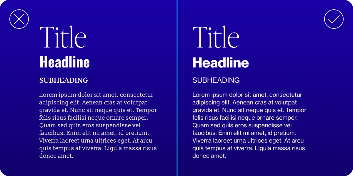
Fonts are fun. There are so many great ones out there to try. But most interfaces will benefit from having just 1 to 3 different fonts, max. And great care should be taken to make sure that all of the fonts chosen work well together.
More than three and your interface will start to look messy and inconsistent, distracting the user from the actual information and words.
2. Control line length
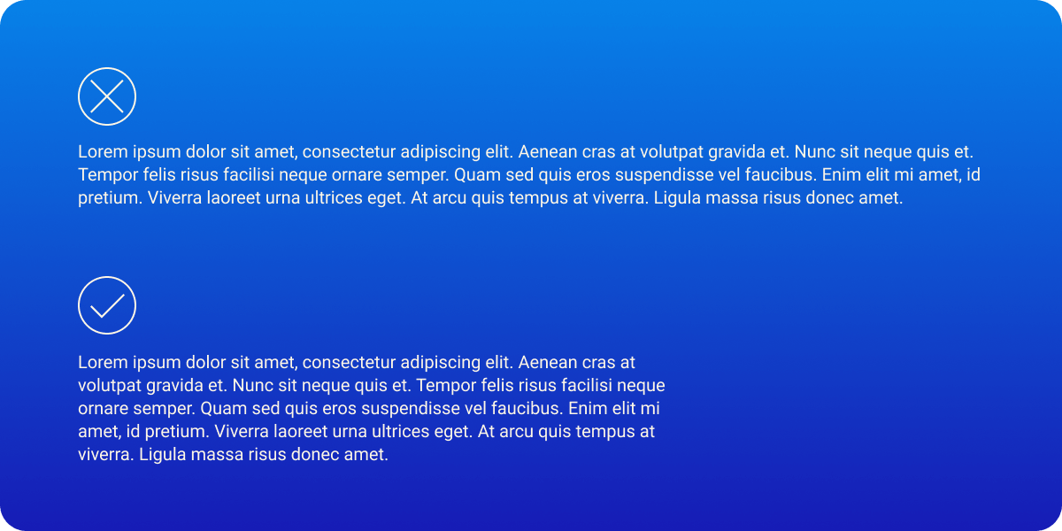
When working with big chunks of text, try to keep the line length between 45 to 75 characters. 66 characters in length is considered to be the sweet spot for improved readability.
The reason is that as our eyes scan the text from line to line, we can easily lose our place if the line is too long. You have probably done something like follow a line of text with your finger in a book, or highlight the line of text you are reading with your mouse so that you don't lose your place. Shorten those lines so your users don't have to resort to such methods.
3. Use a type-scale
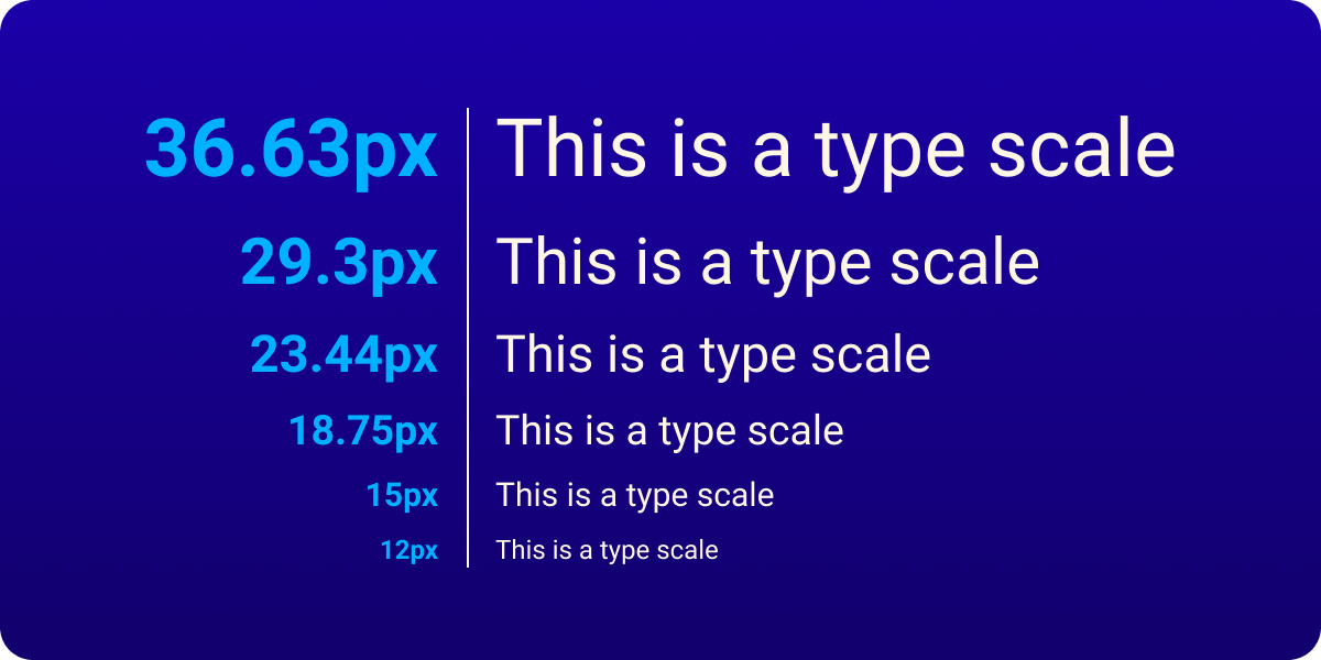
A type-scale is a mathematical method for defining a harmonious and rhythmic set of font sizes for your UI.
You start with a base font size (your body copy), say 18px, and then multiply or divide it by a scale factor to get font sizes larger or smaller in your hierarchy (such as H1, H2, H3, etc.). A common scale factor is 1.25.
This removes the guesswork on your part and makes sure that all font sizes are related to each other. The visual result is one of harmony and consistency.
4. Increase font size for long-form text
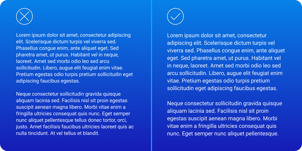
This is a simple and effective way to improve the readability of long pieces of text in your interfaces (articles, posts, legal text, etc.).
Instead of sticking with the "industry norms" of 16px or 18px for body text on the web, try pushing it up to 20px. It will reduce the eye strain of the user, and they will subconsciously thank you for it.
It does depend on the font you have chosen, so make sure you test it before applying it blindly.
5. Make use of contrast

Increase the dynamism of your UIs by utilizing type contrast to your advantage. Huge headline next to small text. Extremely heavy font-weight, next to razor-thin.
This kind of contrast can add drama and artistic flair to a layout. It can pull the viewer in, exciting them about the content.
But always make sure that you aren't compromising the readability of the text.