Designing good user experiences is hard. It can require lots of research, lots of testing, and despite our best efforts to be as user-centered as possible, people can just be hard to please.
Thankfully, a bunch of very smart people have identified common psychological principles that we can take advantage of to guide our users and make the job of designing good interfaces a bit less risky.
Here are a few of the essential ones that you can use right now without getting a designer involved.
1. Law of Proximity

Objects that are near, or proximate to each other, tend to be grouped together by the person perceiving the objects.
Our brains really want to organize objects and group things together. And the closer objects appear to each other, the easier it is for our brains to lump them together in a conceptual grouping.
When we make software interfaces, this idea is easy to make use of by simply controlling the spacing around sets of objects. For example: Increase the margin between separate sections or decrease the margin around items that are of the same kind.
A very common use of this is in typography: Headings may have more space above them than below them, this way the paragraph that came before is not associated with the heading and the paragraphs that come after.
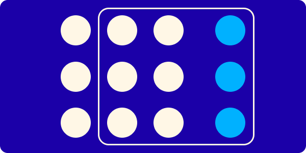
2. Law of Common Region
Elements tend to be perceived in groups if they are sharing an area with a clearly defined boundary.
Related to the previous law, this gives you another simple way to help users figure out what items in your interface are related to each other.
There are a number of ways to create a common region in digital interfaces, but two of the most common are borders and backgrounds. Put a border around the objects that you want users to associate with each other, or, put a background color or image behind them. Both will help your users make sense of the structure of your interface.
3. Von Restorff Effect

Also known as The Isolation Effect, predicts that when multiple similar objects are present, the one that differs from the rest is most likely to be remembered.
Use this effect in combination with a good information hierarchy and well-defined user goals on each screen to determine which elements in the interface need to stand out from the others.
A very common use of this effect is the ubiquitous call-to-action. Usually the button on a screen that will perform the primary action ("Buy now!"), it is often a different shape, color, or size from the other buttons and elements around it to ensure that users see it and remember it.
Don't rely on only one differentiation when taking advantage of this effect (such as just changing the color). You might have color-blind users or users with reduced vision, so a combination of changes is necessary (e.g. different shapes and colors).
4. Hick's Law

The time it takes to make a decision increases with the number and complexity of choices.
Basically, don't overwhelm your users!
The more items there are in a list, or the more possible actions there are in a menu or control panel, the longer it will take your user to decide what they want to do. Longer time to a decision = higher probability of them giving up = bad for them, and bad for you.
A few ways that you can use this knowledge to help your users:
- In general, minimize choices where possible.
- Break complex tasks and flows into smaller steps (checkout, on-boarding, long forms, etc.)
- Highlight recommended options for your users (often used in price comparison tables).
We'll stop there for today, but there are many more psychological laws, effects, and principles that can be applied to digital user experiences.
People are complex and weird, but our brains have developed efficient ways of dealing with information and decision-making that we must take into account when we are building our software.