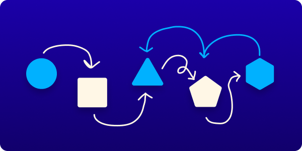
Great processes can produce great work and UX design is no exception. Follow this breakdown of the design thinking method to improve your UX game.
Do you find yourself improvising the interface design process every time your team starts a new project? Perhaps with mixed results: some projects work out great and there are smiles all around (and $$), others... not so much. You also might find it difficult to stick to the same process each time when budgets, priorities, and timelines are always so different. I know I do.
But...
In order to create consistently great work, you need a great process that you follow consistently
– me (and probably other people)
If you do have a great process and your clients sing your praises, the awards are piling up, and users flock to your apps, then well done! Go treat yourself to frozen yogurt, you deserve it. 🍦
But if you don't have a consistent, proven process for creating beautiful, functional interfaces (or you find it hard to stick to one) then read on!
Design Thinking
It turns out there is a mature and very well-defined process already out there that can be directly applied to a huge range of project types: Design Thinking.
And you don't have to be a designer, artist, or another type of "creative" to use it.
Design Thinking, just like UX design, is all about putting the end-user first and working back from their needs and problems so that, hopefully, your final product is actually useful and beneficial to them.
The five steps of the Design Thinking Method
1. Empathize – get to know your users
- Who are you are hoping to help?
- What matters to them?
- Put yourself in their shoes as much as possible.
- Don't assume you know them or their problems!
2. Define – state the problem and the opportunity
- What is the problem the user has that you are hoping to solve?
- What opportunity do you have to innovate for the user's benefit?
- What does success look like for the user? (not the execution, but the outcome of a good execution)
- What does success look like for the business?
3. Ideate – come up with some solutions
- Brainstorming! Activities! Creativity!
- Generate as many potential solutions as possible. Anything goes!
- focus on high-level solutions, don't get lost in the details.
4. Prototype – build a rough version of the solution
- Filter and narrow down your list of solutions to a few of the most promising candidates.
- Build the chosen ideas in low to middle fidelity. The medium/format is not important yet. Choose a medium or tool that allows you to build quickly and get it in front of the users (this could be drawings on paper or a clickable Figma presentation)
- If time and budget allow, prototype more than just one idea so that you have more to test with. If one idea flops with your users, you will have another option ready to test with them.
5. Test – find out if your ideas are working
- Get your prototypes in front of the people you want to help.
- Observe reactions and behaviors. What worked, what didn't?
- Use your findings to iterate on and improve the solution and the prototype.
- Repeat until you have validated an idea that is resonating really well with the users.
It's up to you to decide how in-depth you go in each step, what tools you use, how long you take etc. That's one of the benefits of this method: it's easy to scale up or down based on your timelines and budgets.
As long as you are starting with the end-user and working back from their needs and problems, and then testing your ideas with them, you should be making better interfaces in no time.
Some parting points
- Stop making assumptions about what people need. Ask them instead.
- Prototype quickly and cheaply. This allows you to keep a bulk of your budget (money and time) for the final design and development.
- Testing doesn't have to be complicated or expensive. Get in the habit of doing it early and often.